


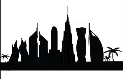
An illustration of Dubai buildings used for the package and instructions paper:
This is the Final main side of my package:

And this is the bottom side of the package:

Here are the final cards, there are 10 cards of each tower, which means 40 in total..
Each card has a question behind about the tower illustrated on the other face of the card.. And the answers are placed on the bottom of each card with a blue color and smaller font size.
I was going to create a separate sheet that has the answers, but in order to make the game more interactive, I decided to place the questions on the bottom and the person who’s supposed to read the question is not the player himself, it should be one of the other players who picks the card, read the question, and announce whether the player gave the right answer or not!
If the player answers the question correctly, he’s allowed to move up the road.. if not, he should stay in the same place!
And here is an example of the questions and answers side: #Burj Khalifa

This is the process of improving and updating the board game:
I decided to make change the background into black to make the colors of the game stand out, and I thought adding the name and logo of the game is making more sense that the clouds on the previous sample! More blocks were added through the process as well, changing a little of the shape of the snake to make it even from all sides..

In order to distinguish my game than other games in the market, I had to add a name and a brand story that says something about the game.
![]()
I placed the name followed by “Snake and ladders game” to show that it’s a re-designed game based on an original one which is a very well known game, copyrighted by the designer stating that it’s a localized version of the game (Dubai version).
“An Exclusive Emirati Board game” < This statement is going to be on the package of my game as well, it’s going to show customers that it’s a new Emirati game! That’s a simple but very affective brandstory of my game that’s going to attract a lot of customers since we don’t really have a lot of such localized games in Dubai!
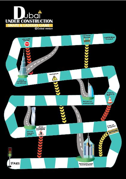
Snakes and Ladders game is an ancient Indian board game regarded today as a worldwide classic! It is played between two or more players on a gameboard having numbered, gridded squares. For my final game design project, I decided to re-design this game and localize it! I also decided to change some of it’s rules, to make it advanced and more interesting!
My idea was to change the layout of the game as a whole, instead of having numbered squares, the blocks are going to go in different directions creating a shape of a snake! And in order to localize the game, I decided to add pictures of famous towers in dubai on the bottom of every road (which is a replacement of the ladder), when the player stops on the block where one of the towers is located, he should pick a card and answer the question behind it about the tower in order to be able to go up the road, which makes the game more advanced and exciting!
I started by designing the board game blocks layout:

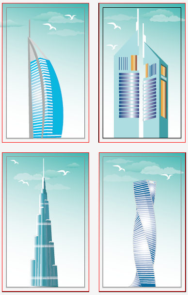
And then I illustrated Dubai towers, I updated the illustrations a lot throughout the process..

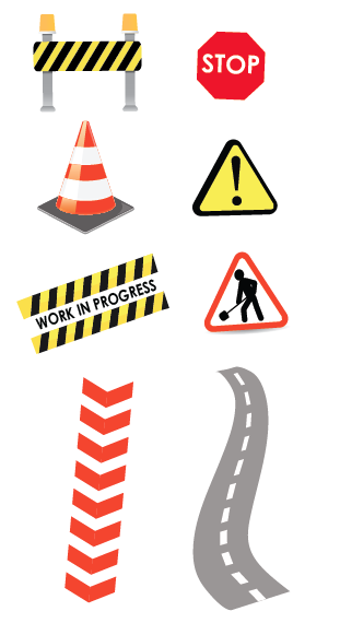
And here are the illustrations of the game elements, the roads are the ladders, and the construction icons followed by arrows are the snakes of my game! I decided to make different construction icons instead of sticking to one through the whole game to make it more interesting, and I added statements on the blocks were these icons are located!
Final design:
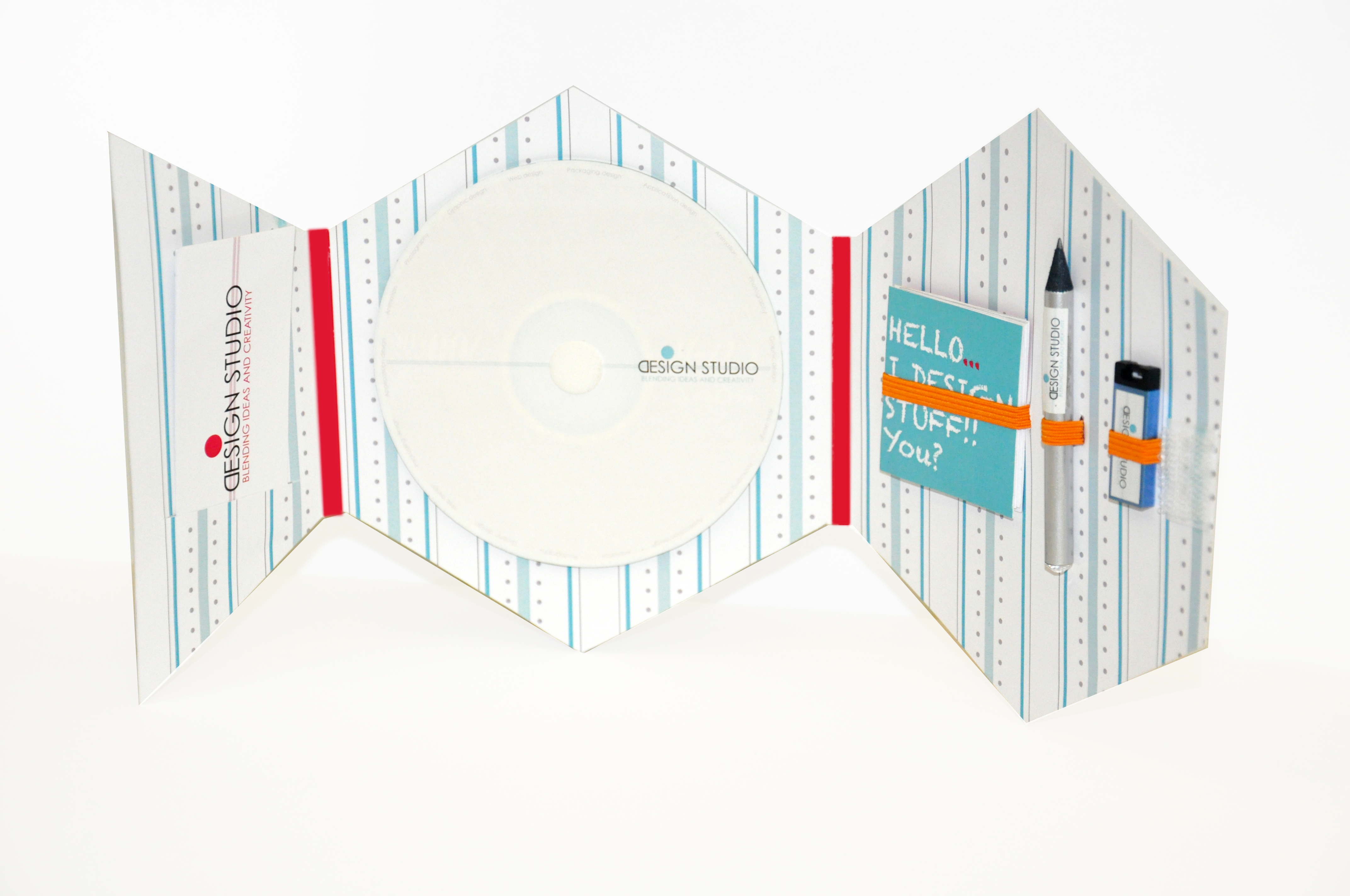
A promotional package that I’d like to give it to my clients to check out my work in the different means of design such as graphic design, web design, application design, and so much more.. all saved in the CD inside the package.
I made it so simple and clean, that’s how my designs usually are. I chose to make it fun and add colors to it, and make it clean and simple from the outside, which indicates that there’s so much that I still want to learn and do in the design world!
The CD contains all the design work I’ve done so far.. I have added the types of designs I can do around the CD in a small font so people would know what I exactly do!
The giveaway on the side include a note book, a tiny pencil and a USB.. with three business cards on the other side with three different fun colors!

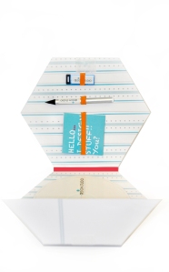
Beauty Shots:

For my own self-promotional package, I decided to create one that contains a CD which has all my work that I’ve done so far.
I do different types of designs such as graphic design, web design, application design, animation, photography, and currently packaging design! I want to show that as if I work as a designer for different clients, and I want to use my self promotion package as a way to promote myself as a designer, for clients to check up my work and contact me if they want me to work for them!
I started by creating a logo, here’s the logo process:
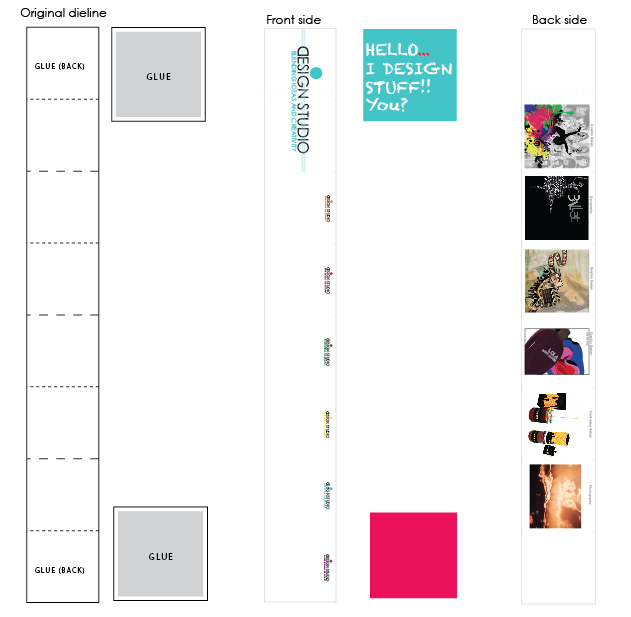
 I didn’t really spend time trying out different die lines for this project, I created my own dieline the way I imagined it, and it worked!
Here’s my simple die line:

I created two patterns for the inner part of my design, tried both, and ended up using the 1st one!

For the giveaway, I made a little note book and a pencil, later on, I added a usb! All with the logo sticked on.
Here’s the original die line and designed one of the note book:
The front side is the side people can write on any notes, and the back side contains examples of my work in graphic design, typography, photography and others..
Business cards are made with three different colors, orange, blue and pink:

This is a self promotional package that I found so inspiring!
I love the idea of putting a CD in the package that contains your work as a designer, I find it interesting!
With business cards, small sketchbooks maybe, a CV or other things that can be inserted in there!
According to the design, I love how simple yet fun and colorful it is! Looks too clean and professional!


